Level 1 · The whole website
The Design Studio
The Design Studio is a slide-in panel that sits on top of the live website. With it you set the overall look – brand colour, fonts, corners, header, cards, shadows – and see every change immediately. Nothing is saved until you explicitly do so.
Opening it
- Log in to the Contao back end as an administrator.
- Open the website in the front end (any ordinary page).
- Click the Design Studio button at the bottom right.
Live preview
While the Studio is open, the sliders only affect the preview. Only Save applies them for all visitors. Discard changes takes you back to the last saved state.
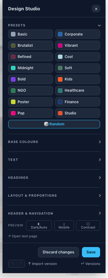
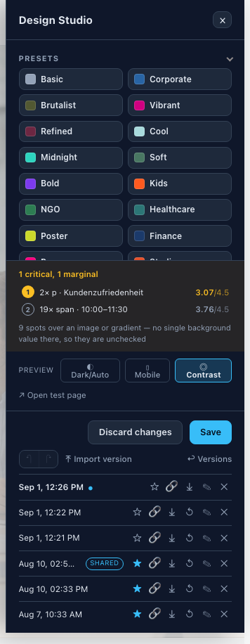
The drawer from top to bottom: Presets and AI design, below them the slider groups (Base colours … Effects), then the preview switches, and at the bottom Save and Versions.
Presets: the starting point
At the very top of the drawer are the Presets – complete looks as tiles (Corporate, Refined, Midnight, Poster …). They are meant as a starting point for a direction, not as the final state:
- Pick a preset that roughly goes in the direction you want. The preview switches immediately – colours, fonts, corners and spacing all at once.
- Fine-tune with the slider groups below: pull the Primary color exactly onto the brand, adjust the Corner radius, set the Density to taste – only the places that don't fit yet.
- When it's right: Save. (Until then nothing is fixed.)
🎲 Random rolls a consistent combination as a starting point if no preset fits. It is the same list that also works as ?persona=name in the address bar (see Showing variants).
The slider groups
In the order they appear in the drawer. Each group expands individually; the names below are the ones used in the Studio.
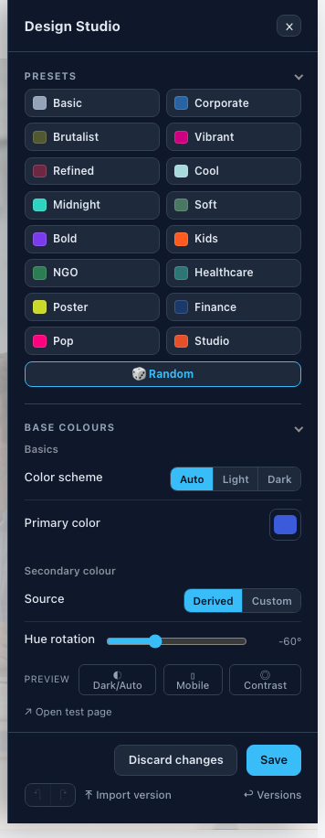
Base colours
| Slider | What it does |
|---|---|
| Color scheme | Auto, Light or Dark for the whole site. |
| Primary color | The brand colour. Lighter and darker variants (hover, borders) are derived automatically. |
| Source (secondary colour) | “Derived” calculates the secondary colour from the primary colour; “Custom” lets you pick it freely. |
| Hue rotation / Saturation | Only with “Derived”: how far the secondary colour is shifted around the colour wheel and how vivid it is. |
| Background color | The page background. |
| Raised surface | Cards, inputs and offset panels. |
| Dark surface / Border color | The dark section surface and the default line colour respectively. |
| Colour stops / Angle | Start and end of the freely chosen gradient and its direction. |
Text
| Slider | What it does |
|---|---|
| Font | The font for body text (a selection of curated web fonts; installed locally on save). |
| Text size / Weight / Line height | Basic measurements of the body text. |
| Text (colour) | The base text colour. |
| Contrast adjustment | When ticked, the brand colour stays readable as text (lightened/darkened if needed). As a surface it stays exact. |
| Lead size / Muted text | Size of the intro paragraph; how strong “muted” text is. |
| Links | Link colour: Primary / Secondary / Custom. |
| On hover | What a text link shows on hover: Off (colour only) · Underline · Growing line · Marker · Thicker line · Wave · Inverted. Applies to links in body text, “Read more” and “Go back” – not to buttons, menus and titles. |
| Underlined at rest too | Links are underlined even without hovering. Hidden with “Growing line” and “Marker”, which have their own resting form. |
Headings
| Slider | What it does |
|---|---|
| Font | Font for headings (or “Like body”). |
| Size / Weight / Line height / Letter spacing | Shape of the headings. |
| Headings / Display | Normal or UPPERCASE – separately for normal headings and the large hero titles. |
| Source (colour) | Heading colour: same as body, Primary, Secondary or a custom colour. |
Layout & proportions
| Slider | What it does |
|---|---|
| Container width / Reading width | Maximum page width; line length of reading text. |
| Density | One factor applied to all spacing – the whole page becomes airier or more compact, the proportions stay. |
| Side spacing / Grid gap | Horizontal padding of the content; spacing between columns. |
| Corner radius | Scales the whole radius ramp (small/medium/large/xl) together – 0 = square, 2× = very round. |
| Border width | Default line thickness of borders. |
Header & navigation
| Slider | What it does |
|---|---|
| Header style | Transparent, Surface, Inverted or Custom colours (then three pickers: background, text, accent). |
| Header position / Opacity when scrolled / Header border / Header height | Behaviour and size of the header bar. 100 % opacity = no glass effect. |
| Hide on scroll | Only with position Sticky. On: the header bar slides away when scrolling down and returns when scrolling up. Off: it always stays visible. |
| Navigation font / Nav font size / Nav weight | Typography of the main navigation. |
| Item spacing / Marker / Separators | How close together the items are; how the active/hovered item is marked (Colour only, Underline, Pill, Pill (springy)). |
| Submenu icon + size | The expand indicator of submenus (Chevron, plus/minus, Triangle, Dot). |
| Dropdown sliders | Background, opacity, shadow, radius, border, padding, row spacing, dividers and link colours of the drop-down submenus. |
Buttons & forms
| Slider | What it does |
|---|---|
| Button size / Button radius | Size and rounding of buttons – high radius values give pill buttons. |
| Button shadow on hover | Whether and how strongly a button gets a shadow on hover. |
| Input height / Input radius | Dimensions of form fields. |
Cards
One set of sliders for all card types: Card surface, Card border, Corner radius, Padding, Shadow (rest), Shadow on hover, Text alignment. “Theme default” leaves each card type at its own default; any other choice applies to all of them together.
Footer
Footer surface offers ten ready-made surfaces (default, raised, gradients, primary/secondary, dark) plus Custom colours with three pickers (background, text, accent). In addition there is Top border.
Effects
| Slider | What it does |
|---|---|
| Shadow depth / Shadow style / Text shadow | Intensity of all shadows; soft or hard shadows; shadow under text. |
| Glow colour / Glow strength | Coloured glow around elements (0 = off). |
| Glass blur / Glass tint | The frosted-glass effect (header, “Glass” surfaces, glass buttons). |
| Image overlay | How strongly the overlay darkens background images. |
| Image filter / Filter strength | A consistent look for all content images (Grayscale, Sepia, Faded, High contrast, Brightened). |
| Transition duration / Pop effect / Page transition | Speed of animations; the springy hover effect; soft cross-fade when changing pages. |
More than sliders
| Feature | What for |
|---|---|
| Presets + 🎲 Random | Complete looks as a starting point – see Presets: the starting point above. |
| AI design | Generate a suggested look from a short description (“joinery, down-to-earth, warm wood”). Only visible if an AI account has been set up in the back end – see Setting up AI design. |
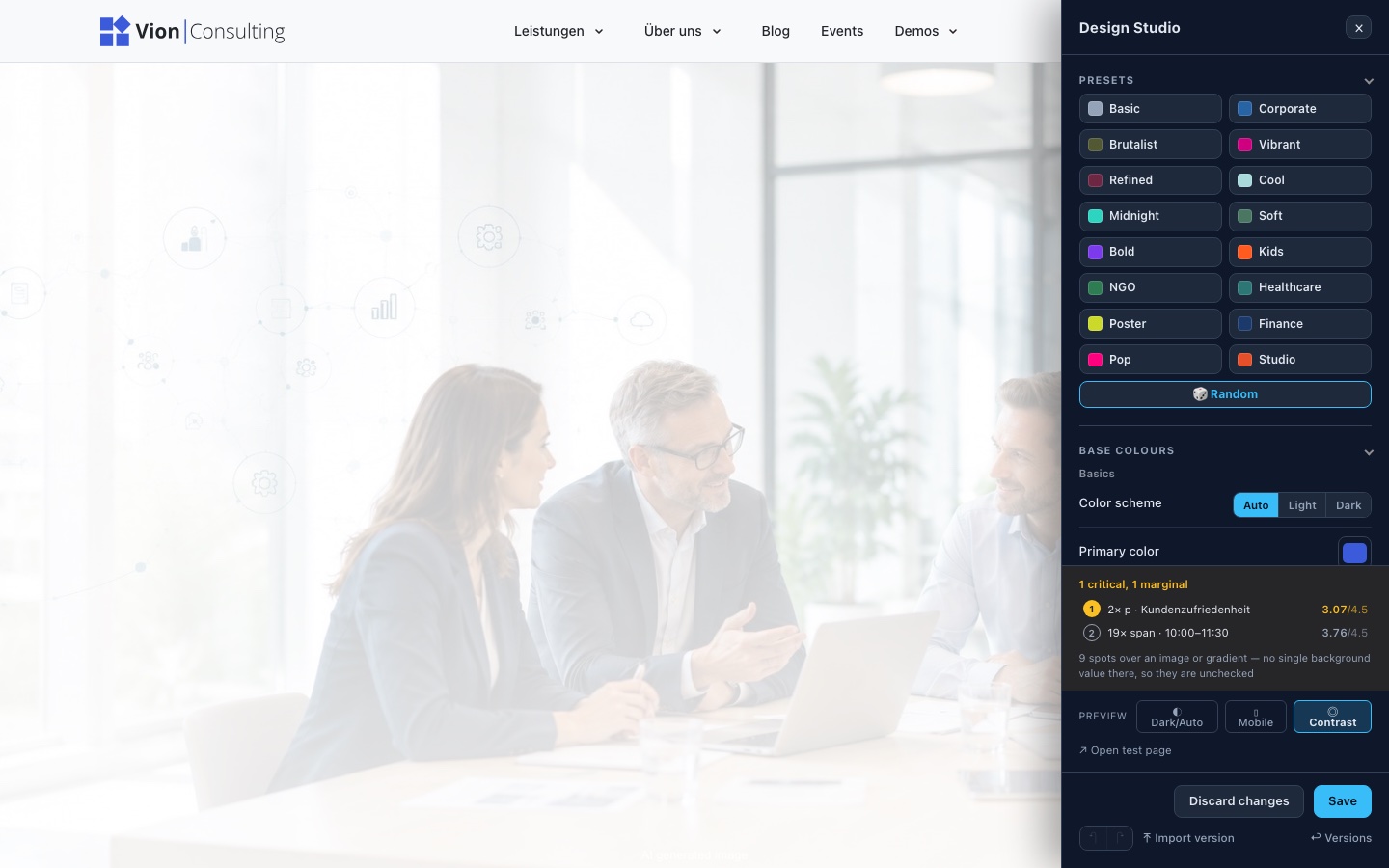
| Contrast | Measures the visible text of the open page in the active colour scheme and marks places that miss the readability standard (WCAG AA). An aid, not proof of accessibility. |
| Preview | “Dark/Auto” and “Mobile” show how the current state looks in other contexts. |
| Versions | Restore, pin or share earlier saved states as a link. |
| Download / Import version | Back up the current look as a file, or load a backed-up file. |
| Undo / Redo | Step back/forward (⌘Z / ⇧⌘Z). |
Setting up AI design (API key)
AI design generation is optional and off by default. An administrator enables it once in the Contao back end – this is also where the API key is stored:
- Open the back end, then in the menu System → Settings.
- On the settings page, scroll to the section Avando AVE Design Studio.
- Tick Enable AI editor.
- Choose a Provider and paste the API key into the field of that name; add a Model identifier (e.g. OpenAI with a current GPT model) and – only for your own endpoint – the Base URL. If in doubt, your developers decide which account and which model to use. The key is stored encrypted and never shown in the form again.
- Save the settings. From now on the Design Studio shows the AI design section.
The Design Studio then shows the AI design section with mood and colour chips, a free-text field and a Creativity slider. A suggestion is only applied, not saved – only your Save adopts it. Without a stored key the section stays invisible.
Saving & resetting
- Save asks once (Really overwrite? – a second click confirms), writes the look for all visitors and automatically creates a version. The history holds 20 entries; pinned and shared states don't count towards that and are always kept.
- Discard changes only affects your own browser – the sliders jump back to the saved state, nothing changes on the server.
- Back to the theme default: choose the Basic preset and save. After that everything comes from the theme defaults again.
There is a project-specific file files/theme/CSS/custom.css for details the sliders don't cover. It is loaded last and wins. If a value is hard-coded there (e.g. a colour or a radius), the matching Studio slider no longer has any effect. Brand colours, fonts and scales therefore belong in the Studio, not in custom.css.
By the way, the Studio itself is optional – a separate
add-on module. Anyone who leaves it out sets the same --av-*
values directly in custom.css or
theme-vars.css. Details:
For developers.
Showing variants without committing
This is exactly what the Studio was built for in an agency: design several directions for a client, save each one as a version and show them to the client via a link on the real, complete site – no staging copy, and nothing goes live until the client has decided.
1 · Save directions as versions
Finish one direction and Save – that is the version. Repeat this for each alternative. In the Versions list you can rename each version (“Direction A – warmer”, “Client approval”) and secure important ones with Pin: pinned states (up to 10) are never deleted, even when the 20-entry history is full.
2 · Send the share link to the client
Click Share link on a version. This gives a normal front-end link with ?version=<id>. Whoever opens it:
- sees the whole website in exactly this look – on every page, with real content, no login needed;
- gets the notice You are viewing this version: at the top – it is clearly a preview, not the live state;
- changes nothing about the saved site. You can send the client three links for three directions.
Share link pins the version automatically so that the link doesn't lead nowhere once the history fills up later.
3 · Adopt the decision
The client names their choice. In the Studio, Restore the matching version and Save – from now on it is the live site. Rejected directions remain as versions in case the client changes their mind.
Quick demo variants: personas
For a first impression – “this is how it could look in vibrant / serious / dark” – the built-in Presets are also available as an address parameter: ?persona=<name> (the same list as the preset tiles in the Studio, just via the URL) recolours a single page view without anyone having to design anything. ?persona=basic shows the theme default.
The difference: ?version=… is a real, saved draft for client approval; ?persona=… is a preview coat of paint from the kit. Both are off by default and don't belong on the public client site – otherwise any visitor could recolour the site via the address bar.