Patterns made from standard elements
Ready-made building blocks
These patterns don't need a special element. You take a perfectly normal Contao element and give it a setting or a CSS class. You enter the class in the class box of the element's CSS ID/class field (Expert settings panel).
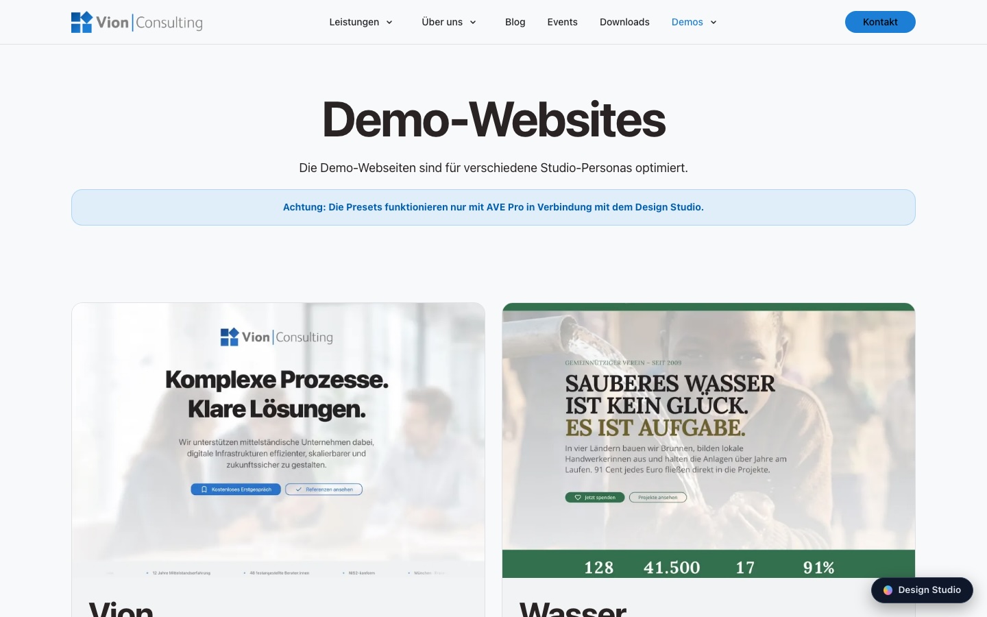
Media card
An element group that starts with an image element: set its Element Style to Media card. The image runs edge to edge up to the card's borders, everything after it (headline, text, button) becomes the padded body.
Accordion styles
A CSS class gives the normal accordion element a different look:
| Class | Look |
|---|---|
accordion--cards | Every entry a rounded box. |
accordion--filled | A coloured bar per title, content indented. |
accordion--accent | A colour stripe on the starting edge of each entry. |
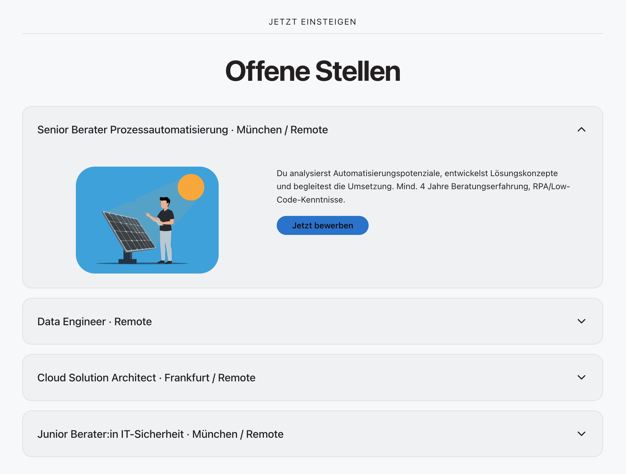
accordion--cards – every entry a rounded box, the open one shows an image, text and a button.Slider with controls over the slides
On the normal image slider, the class slider--overlay (in
the CSS ID/class field of the slider
element) puts the arrows/dots over the slides instead of below
them. Better leave it off for text sliders – there the controls are
safer as a separate row below.
Description lists
The “Description list” element is two-column by default, with a line above each pair. Modifiers (in the CSS ID/class field):
description-list--plain | without dividers – for short blocks of facts. |
description-list--stacked | always stacked, even on wide screens. |
Background video
Not an element but a section setting: in the article's Design panel, set Background to a “Background video …” option, then choose the video and the still image. The video plays muted in a loop; a pause button is added automatically. With reduced motion, without JavaScript or with an unsupported format, the still image is shown – without a still image the section stays empty in these cases. Details: Sections & layout.
One-page navigation
A module for pages whose navigation jumps to anchors on the same
page. It automatically lists every published article on the page
that has a CSS ID (article title = label,
the ID = jump target). Alternatively you enter your own list in the
format Label | anchor-id. While scrolling, the section that
is currently visible is highlighted in the navigation.
- The One-page navigation module has to be on the page – usually the agency includes it once in the page layout (header area). You can tell it's already there when the navigation follows along as you scroll.
- For an article to appear in it, give it a
CSS ID in the
Expert settings panel (e.g.
services). The article title becomes the menu item, the ID the jump target.
Blog & events
News and event entries carry the same Design fields as an article (layout, background, alignment … for the single post). How the overview lists look (cards, rows, “upcoming events”) is part of the configuration of the respective list module – the agency sets that up. You only maintain the content; the card display comes automatically.
Project patterns (optional)
Some projects bring additional patterns in files/theme/CSS/custom.css. They are not part of the core theme and only active where they are needed:
| Class | Pattern |
|---|---|
fund-progress | Donation bar: a single text element with the class, plus the inline style --fund-pct: 62% for the fill level; the figures sit next to it as normal text. |
donate-amounts | Amount chips: the class on a Contao “Radio button menu” form field – the labels become clickable chips. |
cap-row | Numbered list of steps/services (large number on the left, title + text on the right). |