Level 3 · A single building block
Designing individual content elements
Every content element (text, image, headline, button …) has a collapsed Element Style panel (one of the grey section bars in the edit form). With it you frame just this one element – as a card, with a background, across several columns, with an image shape.
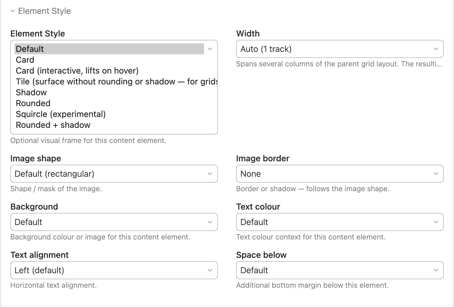
Element Style
An optional visual frame. The choices differ depending on the element type.
For text, image, list, table …
| Option | Effect |
|---|---|
| Default | No frame. |
| Card | Surface, border, rounding, padding, shadow. |
| Card (interactive) | Like Card, lifts slightly on hover. |
| Tile | Surface with padding, but without rounding and shadow – for grids with dividers. |
| Shadow | Just a drop shadow, nothing else. |
| Rounded | Large corner rounding (content is clipped). |
| Squircle | Very soft corners (experimental). |
| Rounded + shadow | Both together. |
For buttons (Hyperlink element)
You create a button by inserting a content element of type Hyperlink and choosing the button look in the Element Style panel:
| Default (text link) | Normal link, no button. |
| Primary / Secondary / Neutral | Filled buttons in the brand colour, the second colour or grey. |
| Outline / Outline secondary | Outline only. |
| Ghost / Soft / Dark / Glass | Transparent · muted primary colour · dark · frosted glass (needs a dark background). |
| Large / Small / Pill / Large + Pill | Size and shape. |
Width
Stretches an element across several columns of the section layout: Auto (one column), 2–5 tracks (4 and 5 only in the six-column layout) or Full width. Invalid combinations simply have no effect – the element never breaks out of the grid.
Background & text colour
| Field | Options |
|---|---|
| Background | Default · None · surfaces · primary/secondary colour · background image (+ overlays) · gradients · Glass / Glass dark |
| Background image | File picker – only appears with a background-image option. 1920 px / WebP, moving the file is harmless. |
| Text colour | Default · Light (for dark backgrounds) · Dark (for light backgrounds) · primary/secondary colour |
Works exactly as on a section – just for this one element. Details and notes on overlays are under Sections & layout.
Alignment
| Text alignment | Left · Center · Right – in the text element it reaches down into the paragraphs. |
| Self-alignment | Image and button elements: the element shrinks to the width of its content and moves to the left / centre / right. |
Image: choosing a size
The image element has the Image size field with ready-made presets. They crop the image to a fixed ratio – so upload large images with the subject in the middle (rule of thumb: at least twice as many pixels as listed below).
| Preset | Pixels | For (desktop) |
|---|---|---|
| Wide 2:1 · large | 1280×640 | an image across the full content width |
| Landscape 3:2 · medium | 800×533 | image next to text, or two images side by side |
| Landscape 3:2 · small | 600×400 | three images side by side |
| Square 1:1 | 600×600 | tiles, galleries |
| Portrait 3:4 | 480×640 | portraits, team |
| Card 16:9 · XL / L / M / S | 1280×720 … 480×270 | image at the top of a (media) card: the more cards side by side, the smaller (XL = one, S = four) |
| Thumbnail 4:3 · mini | 240×180 | small thumbnails in news and event lists |
Image: shape & border
On image elements and on the attached image of a text element:
| Image shape | Default (rectangular) · Rounded · Squircle · Circle · Blob (organic) |
| Image border | None · Primary · Secondary · Light · Dark · Shadow – follows the chosen shape |
Logo: colour from its surroundings
A logo in fixed colours doesn't look good on every background – on a
coloured header or in dark mode it easily disappears. If you add
logo-tint to the CSS class (the second box of the
CSS ID/class field) of the element that
shows the logo (Hyperlink, Image or Text with image), the logo takes on
the colours of its surroundings: the word mark the text colour, the
symbol the accent colour. In the header those are the header colours, in
the footer the footer colours. That way it stays readable in every
preset and in both colour schemes.
| Logo file | With logo-tint |
|---|---|
| SVG with named parts | is recoloured: logo-mark in the accent colour, logo-word in the text colour |
| SVG without named parts | keeps its own colours |
| PNG, WebP, GIF, AVIF (transparent background) | becomes a single colour in the text colour – only suitable for single-colour logos |
| JPG | always stays as it is |
If you replace the logo with a colourful one that should keep its colours, remove the class again. How to name the parts of an SVG is described in the developer section.
Image: AI labelling
Images that were created fully or partly with AI can carry a visible notice. You set the checkbox on the file, not on the element: edit the file in the file manager and tick AI-generated. From then on the image carries the notice wherever it appears on the website – in the image and text elements, in galleries, in news and event lists, on the detail pages and as the background image of sections, element groups and elements (including the still image of a background video).
How and where the notice appears is set once for the whole website: in the website root of the site structure, section AI labelling.
| Setting | Choices |
|---|---|
| Position | on the image bottom right (default), bottom centre, bottom left, top right, top left, right edge vertical, in the centre – or below the image. For background images the corner of the section or element applies; “below the image” appears bottom right there. |
| Size | small, medium (default), large |
| Appearance | dark (default), light, accent in the primary colour of your design – or no background: the text only, white with a shadow on the image, in the page’s text colour below it |
| Label | leave empty for “AI-generated” (German pages: “KI-generiert”) or enter your own text, e.g. “Created with AI” |
The notice is real text, not an image – screen readers read it out. It sits on top of the image but does not catch clicks: a linked image stays clickable.
Machines can recognise the image too: in the page’s structured data
(schema.org) it carries the property digitalSourceType. If
the image generator marked the file itself as an AI image (IPTC “Digital
Source Type”), that marking is kept in the resized versions Contao
creates for the website. A C2PA signature, on the other hand, does not
survive resizing – that applies to every CMS.
Should Contao or an extension take over the labelling one day, switch
off AVE’s so the notice doesn’t appear twice: untick
Output AI notices in the website root. The
checkboxes on the files are kept. For all websites of an installation
this also works in config.yaml:
avando_ave: ai_label: false.
logo-tint gets no
notice.
Headlines only
| Text size | Visual size independent of the heading level: Default (from level) · Huge · Very large · Large · Medium · Small. |
| Letter spacing | Character spacing: Default · Tight · Normal · Wide · Widest. |
Buttons only
| Button icon | A symbol from a searchable list – or “No icon”. |
| Icon position | Right (default) or Left (before). |
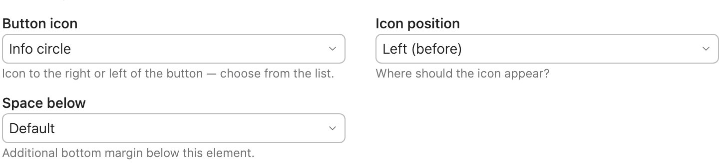
Space below
Additional margin below this element: Extra small to Huge. Available on all element types.
Inline styles
A text field in the Expert settings panel for small individual values that no select menu covers. It is a technical field – only use it if someone has given you the exact value. A few safe snippets to copy:
--av-gutter: 0            /* this area without left/right margin      */
--av-layout-gap: 3rem     /* larger gap between the columns           */
--av-el-color: #ffffff    /* text in this element white               */
--fund-pct: 62%           /* fill level of the donation bar (if used) */
The part in /* … */ is only an explanation – don't copy
it. Separate several declarations with a semicolon
(--av-gutter: 0; --av-el-color: #ffffff). What the design
variables mean is explained on the
For developers page.
- On the image element, style, background and text colour go directly onto the image (so border, rounding and shadow sit tight around the image, not around an empty box).
- The HTML element has no design fields – there you format directly in the HTML you enter.